Loading...

SurveyMonkey Growth Experiments


Company: SurveyMonkey
Role: Product Design Manager, US & International
Released: Original experiment in 2016, with iterative releases

Summary

The Growth team's focus at SurveyMonkey was on four KPIs: Acquisition, Conversion, Engagement, and Retention. The centralized team ran a range of types of experiments; from small copy changes to large-scale initiatives across the entire core product. One of the more complex and successful growth experiments that I proposed and led was an upgrade trigger experience deep within the product.

Note: The user interface has gone through a series of iterations and updates since its original inception, but the intention and functionality have remained the same.

Challenges

The SurveyMonkey product ecosystem heavily relies on upgrade triggers to get users to convert to a paid plan, due to 97% of users having signed up initially with the Basic (Free) plan. Additionally, any purchase experience relied on pairing with the Billing product team, and the code base was quite dated and fragile. Making any changes to, or on top of, the code stack was both challenging and had inherent risks.
Assessment

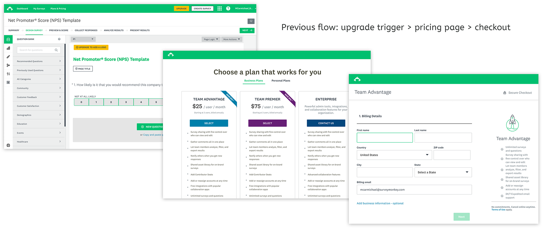
Originally, all upgrade triggers would redirect users to the pricing page, taking users away from the task they were trying to complete, and with no guidance on which plan they needed. From a user experience perspective, this flow was also very jarring and disruptive to the task the user was trying to complete — post checkout, the experience was not returning them to their place in survey creation mode.

Solution & Results

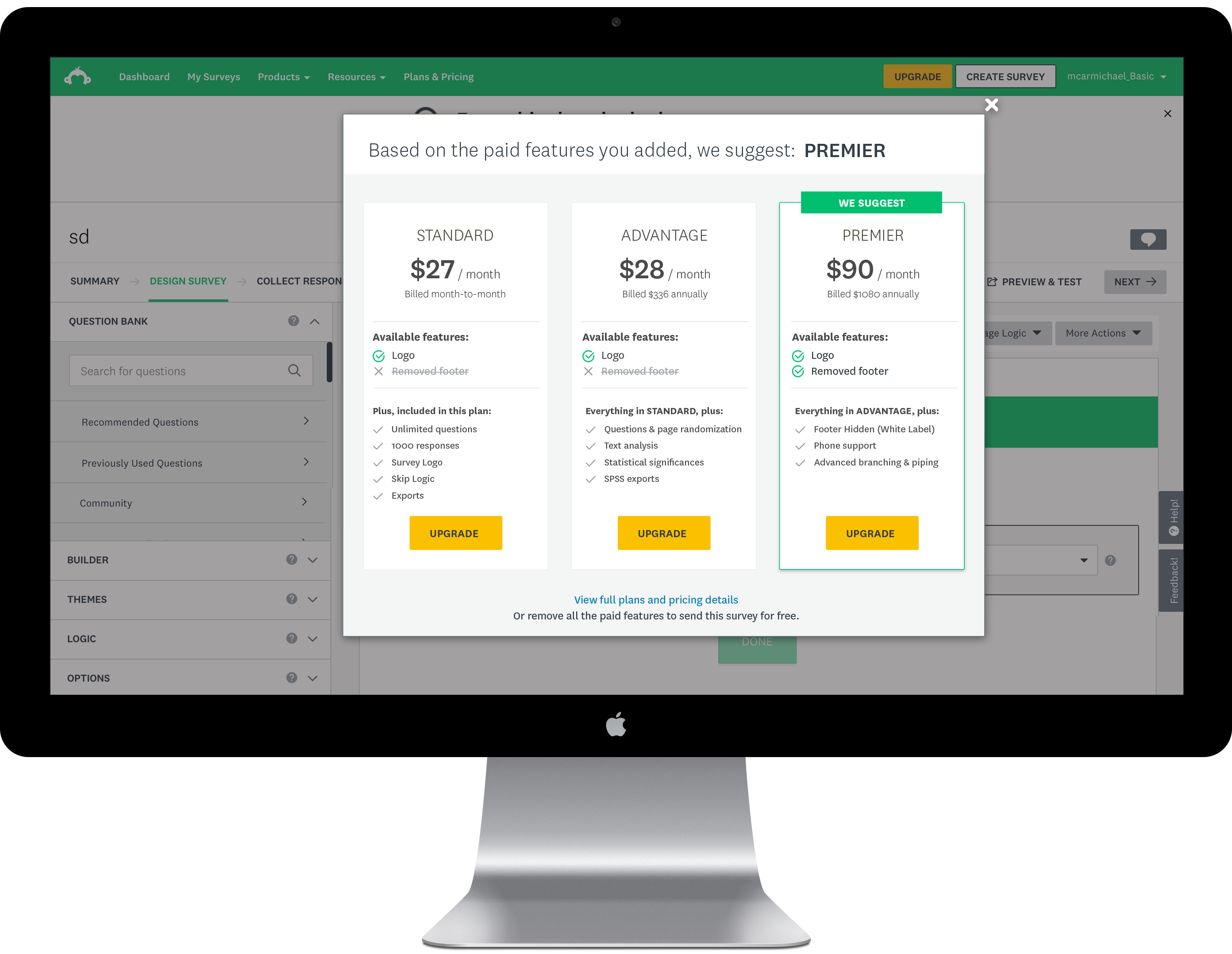
By launching a mini pricing page modal, it not only retained the connection of feature trigger-and-action, but also kept users in context of their workflow. The new design also guided users as to which plan was needed based on the feature they were attempting to purchase. The second step in the modal was a checkout, also avoiding navigating users away to the product's main checkout flow, and streamlining the purchase loop.

Due to technical constraints of the billing platform, the A/B test was initially released with only the pricing screen (and not paired with the second checkout screen). The modal alone achieved a 4% lift in conversion. That was enough of a signal for the engineering team to agree to invest in building out the full flow. Once the pricing and checkout modals were stitched together, we saw upwards of an 8% lift. And like all experiments, we continued to iterate!