Loading...

Side, Inc. Real Estate Transaction Landing Page

Company: Side, Inc. (startup)
Role: Director of Product Design
Timeline: 2 months for Research & Design
Released: 2021

Summary

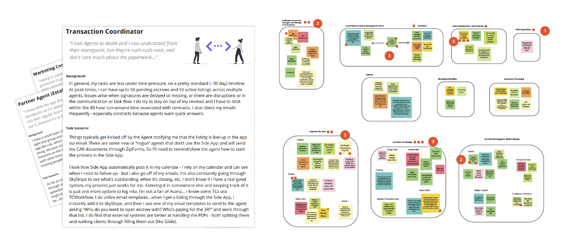
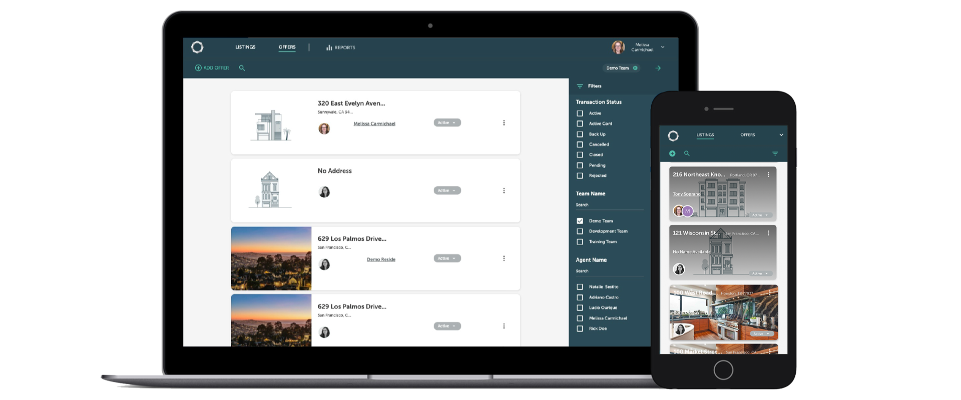
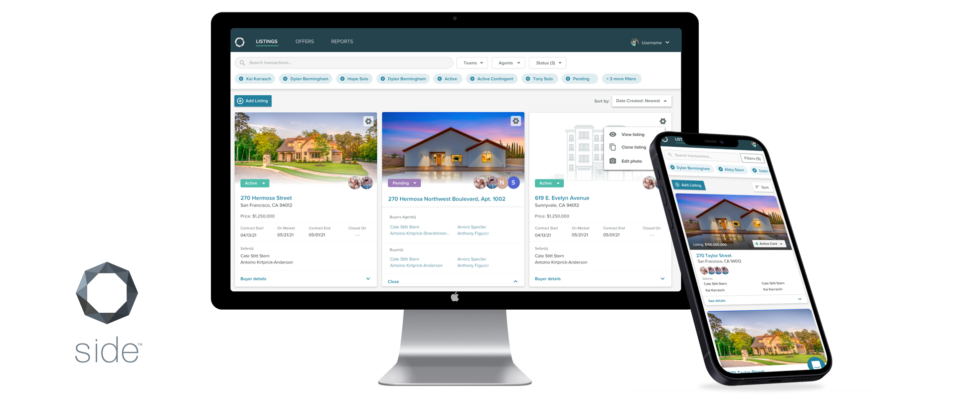
Side, Inc.'s core platform experience focuses on streamlining the end-to-end real estate transaction process; from creating marketing materials to land clients, initiating the listing paperwork, shepherding the signing process across both sides of the deal, the Brokerage's Compliance & Audit review, to then closing the deal and processing for Commission payouts. The first generation of the product had been shaped largely by the engineering team's choice of Material UI components coupled with an early stage design maturity process. This was an opportunity to evolve the user's first touchpoint with the product through optimization of key items, as well as, work with the team to evolve their process.

Challenges

At the time, the Product Design team was only staffed with 1 junior designer, plus myself (about 3 months in the role). The team was not in the habit of deeply understanding the problem space before jumping into solutions, which was an opportunity to bring Product Design & User Research to the front end of the discovery & definition process to elevate the role as a strategic partner. The project itself had to stay within a strict scope; engineering had slated to start the re-architecture of the code base in early Q1, so any design & research work needed to be completed within a 2-month timeframe and not supersede the predetermined scope. This limited the design work to have a narrow view rather than being able to open it up and rethink the entire experience; but even though it wasn't a full redesign, optimization is still an opportunity!

Discovery & Opportunity Areas

The Product team did not have foundational research or personas, but a few PMs had familiarity with the real estate industry. This left the remaining team (product design & engineering) not well informed on our users. We needed to connect with our users, and for this project, understand the key agent team roles in processing the transactions. And just as importantly, bring the whole cross functional team along for the ride and start capturing our insights.

As a first step, I led the discovery activities in the following areas, with various team members co-facilitating:

• Conducted 20 customer interviews to understand the 4 main role types and how they interacted with the product
• Wrote User Scenarios to represent a snapshot of that role's behaviors, attitudes, and pain points, which provided the much needed context to the rest of the team
• These inputs fed into a 2-hour Design Thinking workshop which brought in members of the company outside the product team, such as Sales Engineering, Account Managers, and Brokerage, to leverage their collective ideas and knowledge
• Guided the team in generating ideas utilizing a creative matrix, then clustered the ideas into themes, and voted on their level of impact
• Held a separate 2-hour regroup meeting with the cross-functional product team leads only to discuss & prioritize the ideas, determine level of effort, and align on project goals and measured outcomes


Project Goals

The product team's aligned goals fell into two categories for the optimization work:

Inform the View - Provide key "at a glance" transactional details
Organize the View - Empower users to configure the data that best suited their role's function or personal preferences

Additionally, I conducted a Heuristic Analysis of the experience to call out key usability and interaction areas to be fixed.

Our measured outcomes centered around an increased satisfaction of the product through the display of additional transaction information, an increased engagement overall, and adoption rate of the new features added.

Generation 1.0 (Before Redesign)

Key issues with the current experience included:

Design Patterns: Our users were high-end real estate agents who lived & breathed iOS design, yet the product leveraged Material UI components, which they were unfamiliar with from a UI pattern perspective, but they also did not emulate a consumer-grade experience
Usability: No “at a glance” key info such as key dates and readability issues with the text being truncated or running over imagery on mobile
Workflow Support: Filters were not persistent across sessions, and search functionality was buried behind clicks, yet certain roles depended on these to have a focused view of their transactions
Imagery: The transaction photo auto-populated based on the MLS transaction ID, which was problematic if it pulled an agent headshot, company logo, or other unidentifiable imagery

Design Optimization (After)

Areas we were able to evolve the experience included:

Design Patterns: Work with engineering to determine which elements we needed to customize to go beyond out-of-the-box Material UI components
Usability: Now displaying key “at a glance” information such as key dates and improved readability
Workflow Support: Filters were persistent across sessions and search functionality was exposed and had an active focus state
Imagery: The transaction photo was editable, allowing users to change from the other MLS library of images or upload a new one entirely

Unfortunately, having alternate views to support some of the key team roles—such as Transaction Coordinators preferring a list view with no images—was something the designer explored in concept testing, but we were not able to build that out for the initial release.


Results & Learnings

Since the tracking code had not been established in the Generation 1.0 product, we were not able to measure the delta between the changes, but were able to monitor the engagement and collect qualitative feedback on the design changes. Here's what we saw within the first two months of release:

• Increased customer satisfaction with the new transactional information displayed
• Monthly activity on filters included: 50% on agent names, 33% on file status, and 22% on team names
• On average, Edit Photo was utilized 158 times (12% of unique sessions), with 72% resulting in photo upload

Additionally, the team's feedback on the new discovery & definition process was positive. In particular, the engineering team expressed gratitude for the opportunity to gain more customer empathy and asked to join further workshops.

A major takeaway was realizing the current model of the landing page was really only catered to Seller Agents and did not fully support the Buyer Agent experience. This was mainly due to the Sell side experience orienting on an object (property listing) and then the management of fielding multiple offers. However a Buyer Agent experience orients around the buyer/client (people), who typically searches and visits multiple properties, and then makes few offers. We earmarked the Buy Side user research for the 2022 roadmap and the team was due to explore how that transaction management experience should branch away from an object-oriented approach and put the Buyers (people) in the center of it to support those unique user flow needs.